Best Image Size for Websites, Blogs & Social Media
Every dimension you actually need — website elements, blog images, and every major social platform — in one reference.
Upload an image at the wrong size and one of two things happens: it looks stretched, cropped, or pixelated, or it loads slower than it needs to because you’re serving pixels nobody can even see. The best image size for websites, blogs, and social media isn’t one universal number — it depends entirely on where the image is going, since a hero banner, a blog thumbnail, and an Instagram Story all serve completely different display contexts.
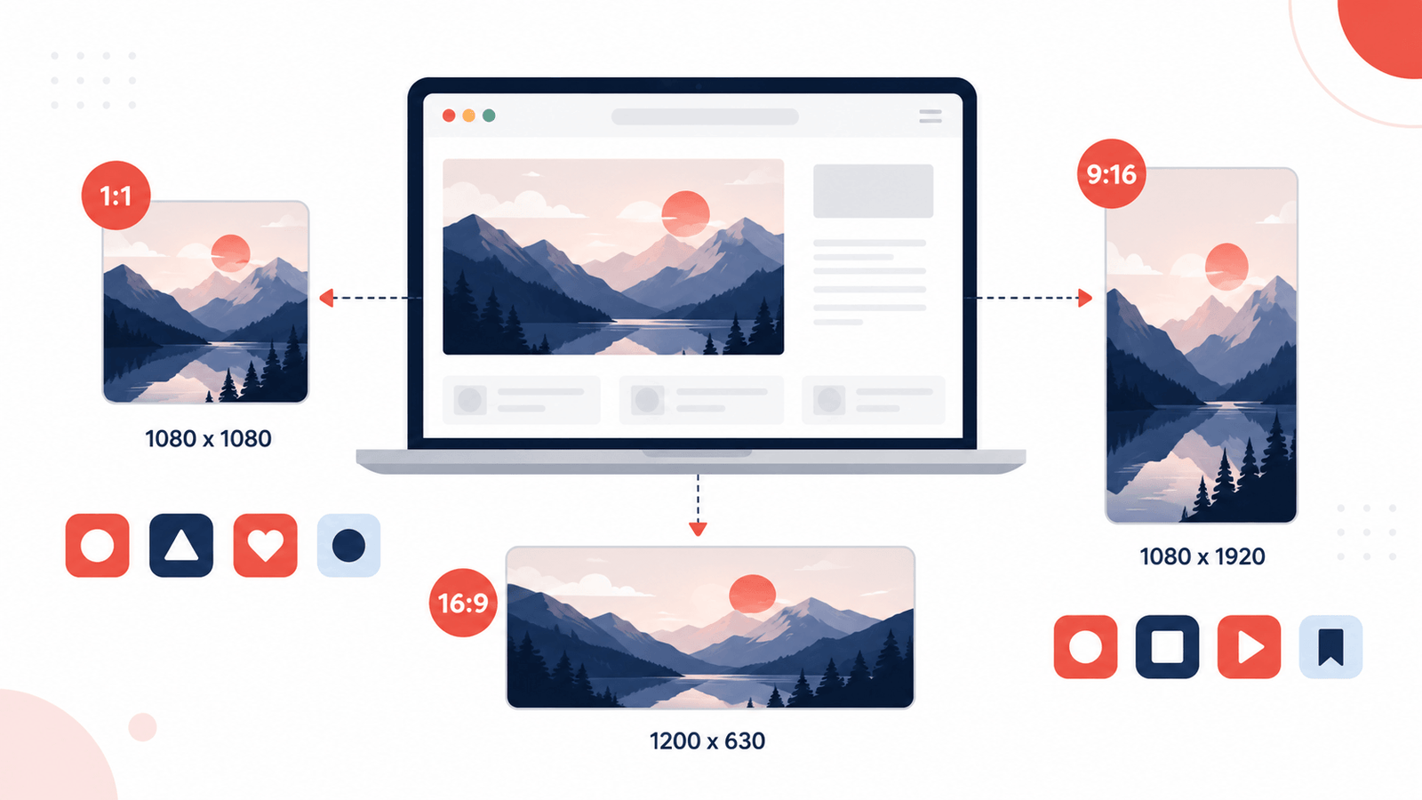
The ideal image size for websites depends on the element: hero banners typically use 1920 × 1080px, blog featured images work best at 1200 × 630px, and thumbnails stay around 300 × 300px. Instagram feed posts are 1080 × 1080px, Stories and Reels are 1080 × 1920px, and YouTube thumbnails are 1280 × 720px. Full breakdowns for every platform and element are below.
Why Getting the Right Image Size for Websites Actually Matters
Wrong dimensions cause two very different problems depending on which direction the mistake goes. Upload something too small, and a platform stretches it to fit, producing a soft, pixelated result that looks unprofessional no matter how good the original photo was.
Upload something too large, and the platform typically scales it down automatically — but the oversized file still has to load first, adding unnecessary weight to a page or a slower upload for no visible benefit. On a website specifically, this directly affects page speed, which factors into both user experience and search rankings.
There’s a third, quieter problem too: wrong aspect ratios. Even a perfectly sized file gets awkwardly cropped if its proportions don’t match what the platform expects, sometimes cutting off exactly the part of the image that mattered most.
Best Image Size for Websites
These cover the standard elements most sites need, regardless of platform or builder.
Best Image Sizes for Blog Posts
Blog-specific images serve a dual purpose — they display in-post and often get pulled for social share previews.
Best Image Sizes for Social Media
Every platform crops differently, and getting caught by an unexpected crop is the single most common social image mistake.
X (Twitter)
YouTube
How to Actually Resize an Image to These Dimensions
Once you know the target size, getting there without losing quality is a short process. Use an image resizer to set the exact pixel dimensions for the platform or element you’re targeting, then run the resized file through an image compressor to shrink the file size further without a visible quality drop.
Always resize before compressing, not after — compressing an oversized image wastes effort on pixel data that gets discarded the moment it’s resized down anyway. If the source photo doesn’t match the target ratio at all, crop it to the correct proportions first, then resize — trying to force a mismatched ratio into the right pixel count just produces a stretched or squeezed result.
Pair This With Full Image Optimization
Getting the dimensions right is one piece of the picture — see How to Optimize Images for SEO for the full process covering compression, format choice, alt text, and file naming together.
Why Aspect Ratio Matters as Much as Pixel Size
Two images can share the same width and still crop completely differently if their aspect ratios don’t match a platform’s expected shape. Uploading a square image where a platform expects 16:9, for example, usually results in an automatic crop that cuts off the top and bottom — often losing exactly the part of the image that mattered.
This is especially easy to get wrong with cover and banner images, since most platforms overlay a profile picture or other UI element on top of part of the banner. An image that looks complete in isolation can end up with its most important detail hidden behind that overlay once it’s actually live.
Not sure what ratio your image currently is or what it should be? Use the aspect ratio finder to check an existing image, or the aspect ratio calculator to work out the right dimensions before you crop or resize.
When in doubt, match the ratio first and the exact pixel count second. A correctly-proportioned image at a slightly different resolution will almost always look better than a wrong-ratio image forced into the right pixel dimensions.
Common Mistakes With Image Size for Websites
Frequently Asked Questions
What’s the best image size for a blog featured image?
Do I need different image sizes for every social platform?
What happens if I upload an image at the wrong dimensions?
Is a larger image always better for quality?
Should I resize images differently for mobile versus desktop?
Do favicon and logo dimensions need to be exact?
Final Thoughts
There’s no single best image size for websites — there’s a best size for each specific placement, and matching it prevents the cropping, stretching, and slow load times that come from guessing. Keep this reference handy, resize to the exact dimensions before compressing, and re-check platform specs occasionally, since they do shift over time. A five-minute check against this guide before uploading saves the awkward re-do of fixing a poorly cropped banner or a pixelated feed post after it’s already live.